2 Graphical representation of data
We found that information given in a frequency distribution is easier to interpret than raw data. Information given in a frequency distribution in a tabular form is easier to grasp if presented graphically. Many types of diagrams are used in statistics, depending on the nature of the data and the purpose for which the diagram is intended.
2.1 Histogram
A histogram consists of rectangles with:
Bases on a horizontal axis, centres at the class marks, and lengths equal to the class widths.
Areas proportional to class frequencies.
Note:
If the class intervals are of equal size, then the heights of the
rectangles are proportional to the class frequencies and it is then
customary to take the heights of the rectangles numerically equal to the
class frequencies. If the class intervals are of different widths, then
the heights of the rectangles are proportional to
\(\frac{\text{Class Frequency}}{\text{Class Width}}\). This ratio is
called frequency density.
Table below shows the frequency distribution of the plant height of 50 plants. Draw a Histogram.
| Plant height | 130 – 139 | 140 – 149 | 150 – 159 | 160 – 169 | 170 – 179 | 180 – 189 |
|---|---|---|---|---|---|---|
| Frequency | 3 | 6 | 17 | 13 | 8 | 3 |
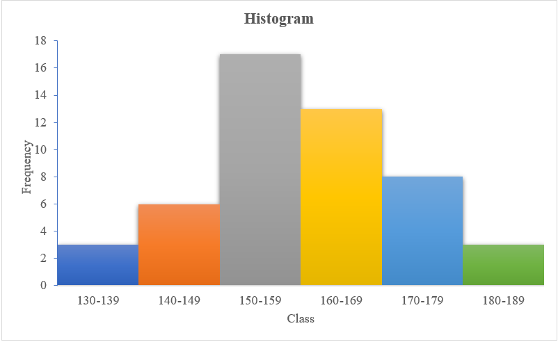
Figure 2.1: Histogram
2.2 Cumulative frequency curve (Ogive)
A graph obtained by plotting a cumulative frequency against the class boundary and joining the points by a smooth curve, is called a cumulative frequency curve. It is also called as Ogive. Two types of ogive are there, Less Than Type Cumulative Frequency Curve (Less than Ogive) and Greater Than Type Cumulative Frequency Curve (Greater than Ogive).
2.2.1 Less than Ogive
Also known as less than type cumulative frequency curve. Here we use the upper limit of the classes and the less than cumulative frequency to plot the curve. Let us see for the example of plant height of 50 plants.
| Upper limit | 139 | 149 | 159 | 169 | 179 | 189 |
|---|---|---|---|---|---|---|
| Less than Cumulative frequency | 3 | 9 | 26 | 39 | 47 | 50 |
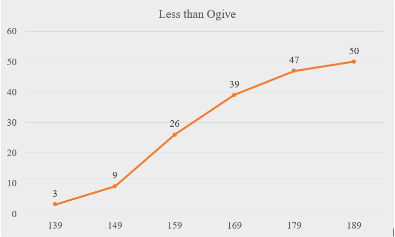
Figure 2.2: Less than ogive
2.2.2 Greater than Ogive
Also known as greater than type cumulative frequency curve Here we use the lower limit of the classes and the greater than cumulative frequency to plot the curve.
| Lower Limit | 130 | 140 | 150 | 160 | 170 | 180 |
|---|---|---|---|---|---|---|
| Greater than Cumulative frequency | 50 | 47 | 41 | 24 | 11 | 3 |
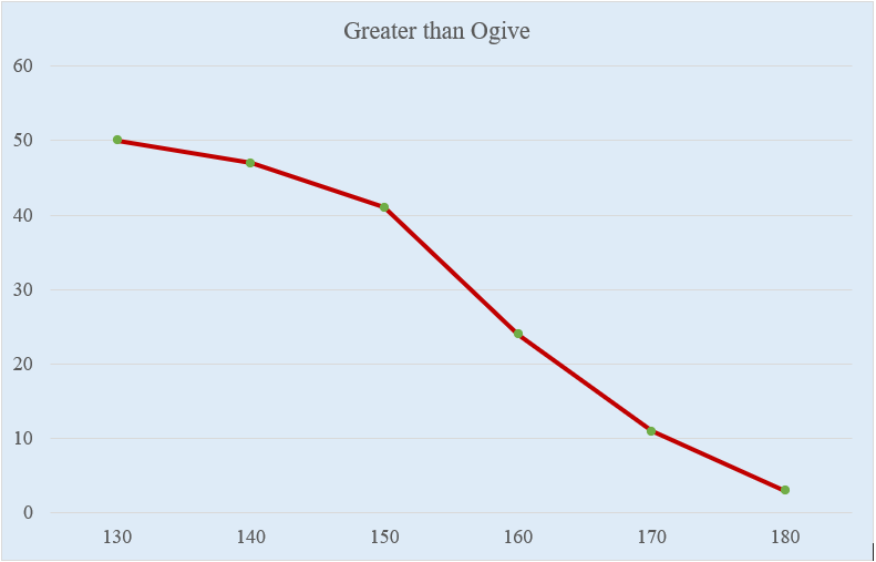
Figure 2.3: greater than ogive
Note:
Intersection of both ogives gives the median.
2.2.3 Frequency polygon
A grouped frequency table can also be represented by a frequency polygon, which is a special kind of line graph. To construct a frequency polygon, we plot a graph of class frequencies against the corresponding class mid-points and join successive points with straight lines. Frequency polygon is also obtained by joining the midpoints of a histogram as shown in Fig 2.5.
| Class Midpoints | 134.5 | 144.5 | 154.5 | 164.5 | 174.5 | 184.5 |
|---|---|---|---|---|---|---|
| Frequencies | 3 | 6 | 17 | 13 | 8 | 3 |
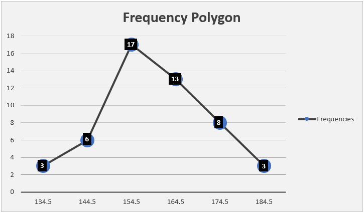
Figure 2.4: Frequency polygon
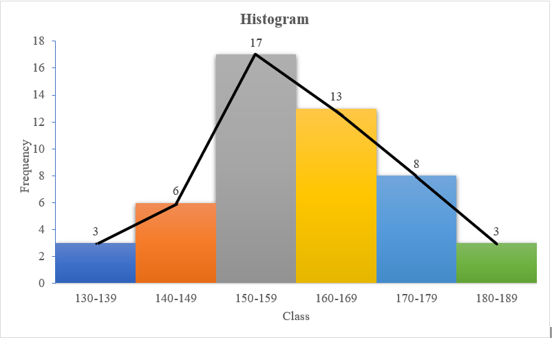
Figure 2.5: Frequency polygon and histogram
2.3 Stem-and-leaf plot
A stem-and-leaf plot is a graphical device that is useful for representing a relatively small set of data which takes numerical values. To construct a stem-and-leaf plot, we partition each measurement into two parts. The first part is called the stem, and the second part is called the leaf. Here each numerical value is divided into two parts: The leading digits become the stem the trailing digits become the leaf. One advantage of the stem-and-leaf display over a frequency distribution is that we retain the value of each observation. Another is the distribution of the data within each groups is clear. A stem-and-leaf plot conveys similar information as a histogram. Turned on its side, it has the same shape as the histogram. In fact, since the stem-and-leaf plot shows each observation,it displays information that is lost in a histogram. A properly constructed stem-and-leaf plot, like a histogram, provides information regarding the range of the data set, shows the location of the highest concentration of measurements, and reveals the presence or absence of symmetry.
Consider the example
12,16,21,25,29,26,30,31,37,42,45
stem and leaf plot can be drawn as shown below.
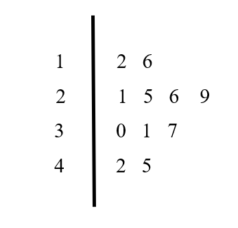
Figure 2.6: Stem and Leaf plot
2.4 Bar chart
A bar chart or bar graph is a diagram consisting of a series of horizontal or vertical bars of equal width. The bars represent various categories of the data. There are three types of bar charts, and these are simple bar charts, component bar charts and grouped bar charts.
2.4.1 Simple bar chart
In a simple bar chart, the height (or length) of each bar is equal to the value of category in the y-axis it represents. For example data below shows the production of coconut in five districts of Kerala in a certain year.
| District | Production (million nuts) |
|---|---|
| Alappuzha | 700 |
| Kannur | 800 |
| Thrissur | 980 |
| Ernakulam | 1100 |
| Wayanad | 1400 |
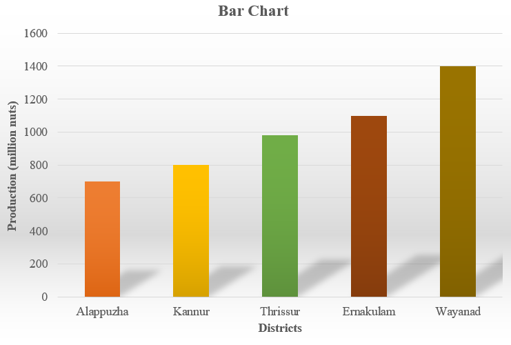
Figure 2.7: Barchart
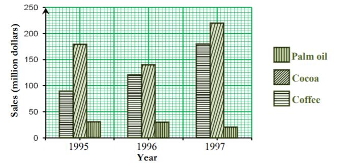
2.4.2 Component bar chart
In a component bar chart, the bar for each category is subdivided into component parts; hence its name. Component bar charts are therefore used to show the division of items into components. This is illustrated in the following example.
Example shows the distribution of sales of agricultural produce from a Farm in 1995, 1996 and 1997.
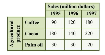
Figure 2.8: Sales data of agricultural produce
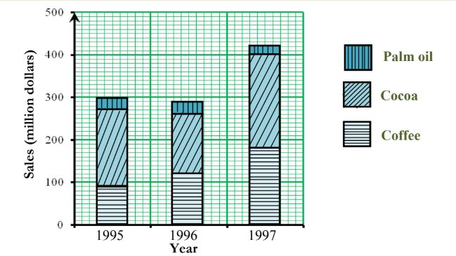
Figure 2.9: Component bar chart
The component bar chart shows the changes of each component over the years as well as the comparison of the total sales between different years.
2.5 Histogram and Bar chart
| Items | HISTOGRAM | BAR GRAPH |
|---|---|---|
| Meaning | Histogram refers to a graphical representation, that displays data by way of bars to show the frequency of numerical data. | Bar graph is a pictorial representation of data that uses bars to compare different categories of data. |
| Indicates | Distribution of non-discrete variables | Comparison of discrete variables |
| Presents | Quantitative data | Categorical data |
| Spaces | Bars touch each other, hence there are no spaces between bars | Bars do not touch each other, hence there are spaces between bars. |
| Elements | Elements are grouped together, so that they are considered as ranges. | Elements are taken as individual entities. |
| Can bars be reordered? | No | Yes |
| Width of bars | Need not to be same | Same |
2.6 Pie Charts
A pie chart is a circular graph divided into sectors, each sector representing a different value or category. The angle of each sector of a pie chart is proportional to the value of the part of the data it represents. The bar chart is more precise than the pie chart for visual comparison of categories with similar relative frequencies.
2.6.1 Steps for constructing a pie chart
- Find the sum of the category values.
- Calculate the angle of the sector for each category, using the
following formula.Angle of the sector for category A =
\(\frac{\text{value of category A}}{\text{sum of category values}} \times 360\)
- Construct a circle and mark the centre.
- Use a protractor to divide the circle into sectors, using the angles
obtained in step 2.
- Label each sector clearly.
See this example. The production of different commodities in India during a particular year is given as follows.
| Commodities | Production(tonnes) | Angle |
|---|---|---|
| Wheat | 27000 | (27000/81000)×360= 120 |
| Grams | 22500 | 100 |
| Maize | 13500 | 60 |
| Rice | 6750 | 30 |
| Sugar | 11250 | 50 |
| Total | 81000 | 360 |
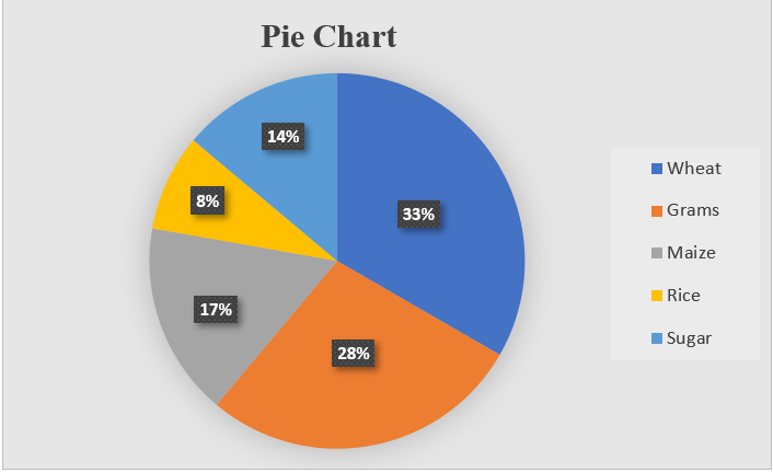
Figure 2.11: Pie chart